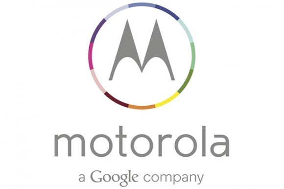
The stylized “M”, used in our thubnail, was introduced in 1955, when Motorola wasn’t known for mobile phones and chips. It was best known as a supplier of defence gear for the US military, helping fight the Reds across the globe.
Now it’s time for a revamp, as the Cold Warrior image went out of style in 1989. Google bought Motorola Mobility a couple of years ago, but it had a rather interesting approach. It did not want to irk its Android hardware partners, so it kept the two companies separate, divided by an imaginary firewall.
The new logo is colourful and it’s gray rather than black. It no longer screams “quick, let’s nuke some communists” and it looks a lot friendlier. It also states that Moto is now “a Google company” and we all know Google doesn’t want to do (much) evil.
However, it seems very unlikely that Motorola will use the new rainbow logo on actual products. It would be tough to produce, so we’ll probably see a monochrome version, which also may explain why the shape wasn’t changed at all.


