Index
Design and Build Quality
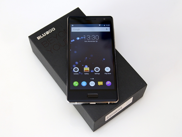
Just a couple of years ago, Chinese phone makers tended to copy Apple, Samsung and other big vendors. Some of them still do, but the Bluboo Xtouch is inspired by another Chinese phone – the Xiaomi Mi4.
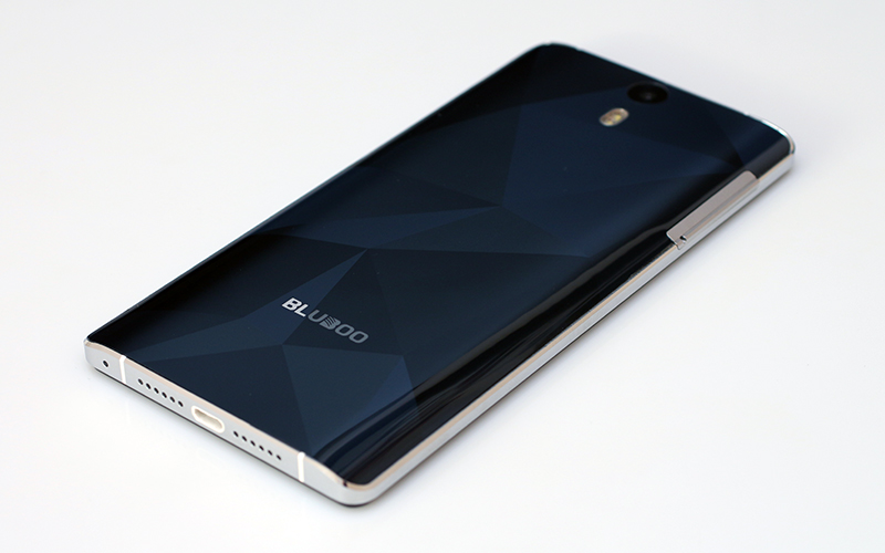
The dimensions are almost identical, as is the design, with a curved back and alloy frame. The biggest differences on the Xtouch are the 3D textured back and the physical home button with integrated fingerprint scanner. The phone also boasts slightly curved 2.5D glass on the front.
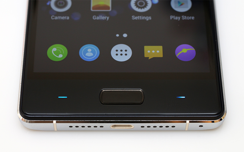
The phone measures 143 x 71 x 8mm. It’s a few millimetres taller than Xiaomi’s 5-inch line-up and we assume the integration of a physical home button had something to do with this.
The metal frame is just 5.5mm thick at the sides, and the curved front and back help create the illusion of a somewhat thinner device. At 8mm, the Xtouch isn’t the thinnest phone around, but the curved edges make it look and feel a bit sleeker.
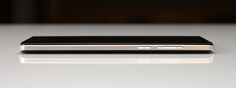
The power button and volume rocker are located on the right.
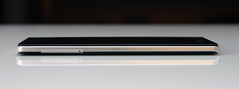
On the left you’ll find an oversized card tray, which can accommodate two SIM cards and a MicroSD card at the same time.
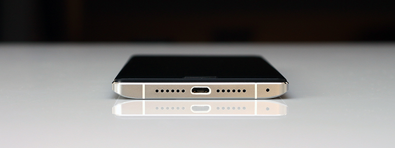
The side firing speaker is located at the bottom (nope, these aren’t stereo speakers, it just Bluboo’s way of keeping the design symmetrical).
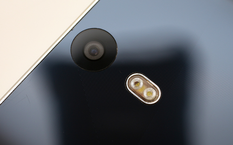
The rear camera and dual-tone LED flash are centred.
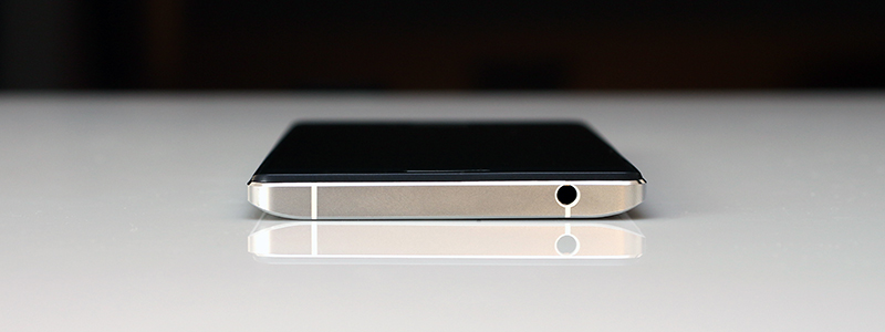
The 3.5mm audio jack is on the top.
A problem we usually encounter when dealing with quasi-flagship devices is that they don’t exactly feel like proper flagships. After all, these are $150-250 phones and it’s clear they can’t feel as good as a high-end device with an Apple, Samsung or HTC logo.
In this respect, Bluboo was on the right track, but it managed to botch it. The choice of materials is ok and the finish feels premium. The Xtouch doesn’t look or feel like a $170 phone, which was sort of the point, but there is a problem.
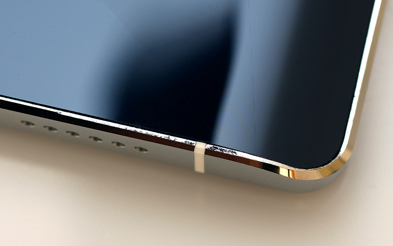
The CNC machined frame feels solid, but the edges on the back are jagged in three different spots. They’re sharp, too, but not enough to cut yourself. Upon closer investigation, we noticed that the top right corner of the device is uneven and slightly curved, which is probably what caused the CNC mill to “miss” the jagged spots. We are not sure if we received an early review sample, but nonetheless this issue is indicative of poor quality control. Some may argue it’s an aesthetic glitch, but it’s definitely not reassuring. Besides, we’ve seen even cheaper devices with impeccable build quality.
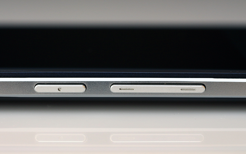
The back sports a glossy finish and doesn’t handle fingerprints well. It is also prone to scratches. The back feels sturdy despite the smooth finish, although we fear the camera is a tad too exposed.
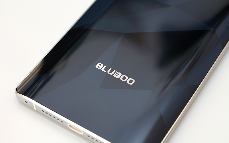
Overall, there’s a lot to like from a purely aesthetic perspective. The Xtouch tries to look like a premium device and in many respects it manages to pull it off. Unfortunately, the build quality is just not there.

