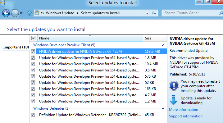
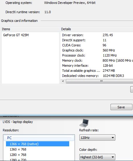
We started Windows 8 installation off of a USB stick and had our first view of the desktop in about 10 minutes. Our test rig was Acer’s Aspire 5745DG with Core i5 450M and Nvidia GT425M graphics. The laptop packs 4GB of memory, so we were well covered. Note however that you will need 2GB of memory in order for the system to run well, as the following picture show. Nvidia’s GT 425M graphics ran flawlessly after our Windows update installed version 270.45 drivers.
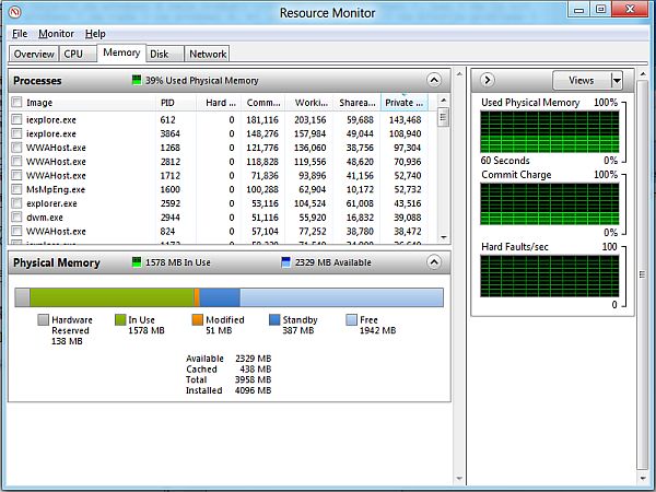
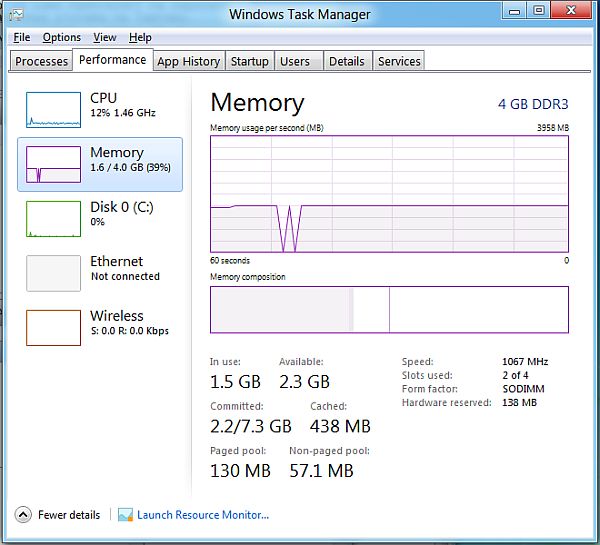
The new task manager offers better overview of used resources and apps.
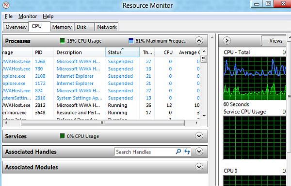
As far as hardware recognition and driver installations go, Windows 8 seems to take care of everything. Upon installation, default resolution was at 800x600, but the OS set it to its native 1366x768 after installing the Windows update.
3D Vision required additional drivers, but that went without a hitch as well. We managed to install Skype, but its current version 5.3.0.120 crashes in Windows 8.

After starting up the laptop, which in our case is less than 10 seconds, we saw the new home screen – Metro desktop. The first encounter, or more precisely the first few hours, we mostly complained over the Metro desktop. Namely, we simply could not get used to it but a few days of usage can do wonders for that.
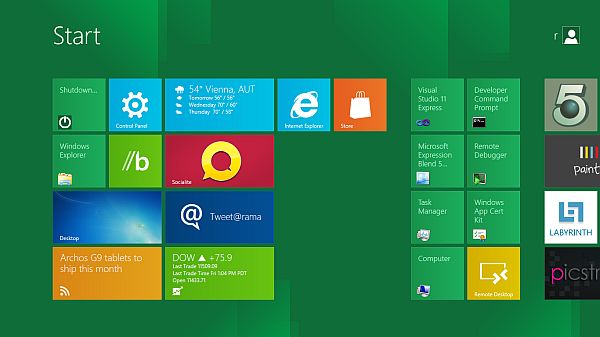
If you intend to use Windows 8 only for surfing, office work or gaming, Metro can be the desktop of your dreams. Unlike classic desktops, Metro offers quick access and nice overview of installed apps. Icons hold more information than their classic versions as well. Besides the static images that you click on to start a program, there are dynamic ones as well that are constantly refreshed, i.e. you do not need to enter a program in order to check out temperatures, humidity or weather forecast. For now, you can only enlarge, shrink or move the icons, but we’re sure Microsoft will implement more options later.
In order to have a nice view across the entire Metro desktop, you’ll need to scroll horizontally. You can do this by dragging the bottom bar or use page up, page down, home, end or cursor keys. It’s more than obvious that Metro has been designed with touch screens in mind, but the good old mouse and keyboard haven’t been forgotten either. The old desktop is still there, but you’ll access it via special icon or the Windows key.
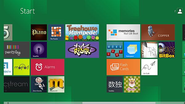
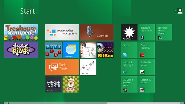
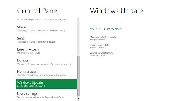
We found the Control Panel on Metro desktop, but the options are not enough for full control of the system. Namely, if you’re trying to switch resolutions, you can’t do it via Metro’s control panel, but rather need to start the desktop control panel version. We’ve noticed that the desktop control panel features almost all Windows 7 options.
If you’re not happy with Metro, you can turn it off using Metro UI Tweaker tool available here. Nostalgic users who crave for old desktop and start menu can now sigh a breath of relief, knowing that Metro is not mandatory.
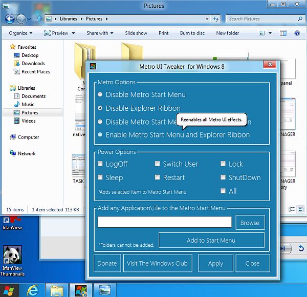

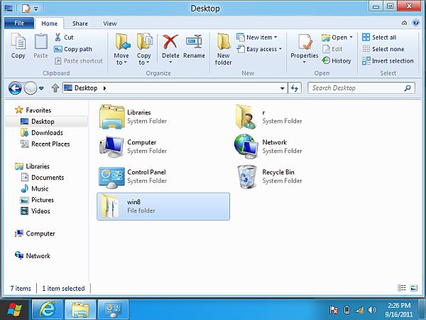
As you can see, Metro UI Tweaker has other options as well. The ribbon bar in Explorer can also be turned off. Microsoft decided to base its explorer’s interface on ribbon design (in the image of ribbon designs in Word 2007 or 2010). The explorer’s ribbon takes up more space than the menus, but it does make certain options available, which previously required right clicking. If the ribbon bothers you, you can minimize it, which is of course possible even without Metro UI Tweaker. However, the ribbon simplifies work to new users and the elderly, while advanced users will still have access to third-party add-ons via right-click context menus.
The upcoming period will be a busy one for Microsoft, as it needs to convince companies and users that Windows 8 is the best option. From what we have seen thus far though, there is much work to be done before Windows 8 is perfect but this might become first operating system that can unite desktop, notebook and tablets, something that both Android and Apple operating systems are missing, at least for the time being.


