Index

Review: Aluminium lady in red
In the aftermath of its not-so-painful breakup with Ericsson, consumer electronics giant Sony is in the process of trying to reinvent itself and aggressively reenter the smartphone space. It is doing so in style, Sony’s NXT generation Xperia devices are some of the best looking Android handsets on the market, but simply getting the design right is not enough in today’s highly competitive smartphone market.
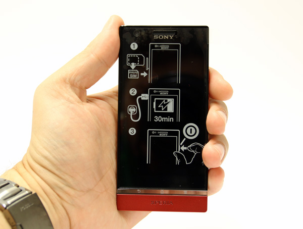
The Xperia P is Sony’s stab at the mid-range market and it sits between the Xperia S in the high end and the Xperia U in the low end. It’s a good looking piece of kit clad in an aluminium shell and powered by a dual-core 1GHz Novathor U8500 chip, courtesy of ST Ericsson. The sleek industrial design and aluminium finish sets it apart from the competition and overall Sony’s designers did a pretty good job. Even the packaging tries to be different, it’s incredibly thin and flat, reminiscent of a paperback book rather than a run of the mill smartphone package. 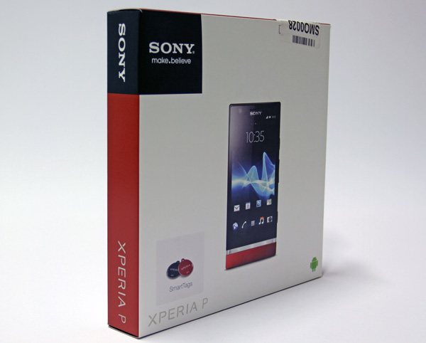
The box includes a standard microUSB cable, charger, a couple of NFC tags and headphones. The in-ear type headphones offer decent audio quality, but we really appreciate the fact that Sony bundled three sets of earbuds and a simple plastic clip, which always comes in handy.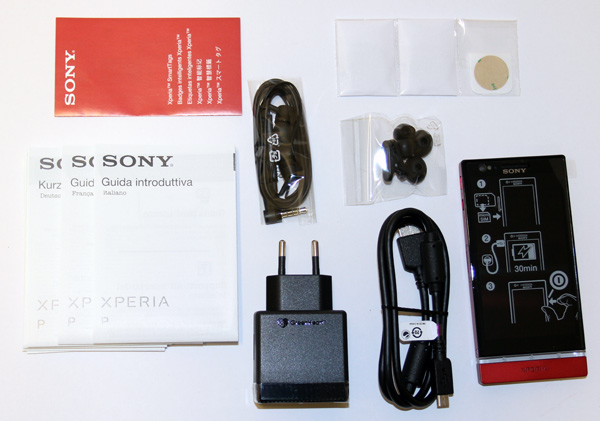
The Xperia P is available in silver, black and red, but there's also talk of a pink version. We got the red version, and we are guessing our female readers will appreciate it. Both of them.
While Sony's flagship Xperia S packs a 4.3-inch 720p screen, the mid-range Xperia P features a 4-inch 960x540 display. It uses Sony’s WhiteMagic technology, which basically means that every pixel features an additional white subpixel. It might sound like a marketing gimmick, but the extra pixel helps keep power consumption down, while at the same time improving legibility in daylight conditions. The results are pretty good and the screen looks great even in near direct sunlight. 
Although it features a 4-inch screen, the Xperia P is not as compact as you might expect. It measures 122 x 59 x 10.5mm and weighs 120g. The boxy design only emphasizes the 10mm girth and despite its bulk it only features a 1350mAh battery. The battery is not user replaceable and there is no microSD slot. Since the phone packs 16GB, many users would appreciate some expansions options. However, Sony opted for an aluminium body that doesn’t allow you to access the insides. This also means that the micro SIM slot is located on the side. 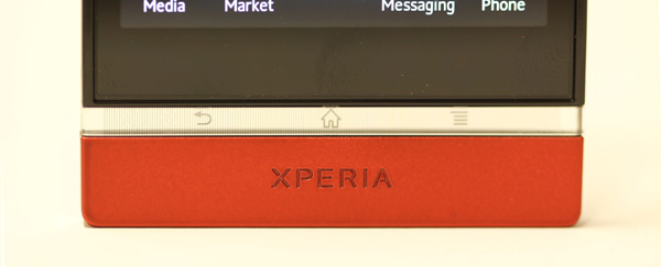
The Xperia P is powered by a Novathor U8500 dual-core SoC with Mali-400MP graphics. Sony uses the same chipset on the dirt cheap Xperia U and it sounds somewhat underpowered for a mid-range phone, but it is practically as fast as last year’s high-end phones. The phone also has 1GB of RAM, so the spec should be enough for snappy performance, in theory at least. However, Sony ships the Xperia P with Android 2.3, not exactly known for snappy performance. An ICS update should arrive this month though, but it is still disappointing to see a two year old OS on a new mid range phone.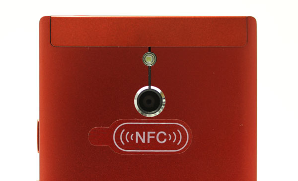
In keeping with tradition, Sony endowed the Xperia P with a pretty nice 8-megapixel camera, along with a front-facing camera. There’s also a dedicated camera shutter button, which is welcome touch. Also on board, an old fashioned FM radio, something that we’ve learned to expect from Sony. HDMI is also a nice touch, as many vendors are ditching HDMI on their phones. The Xperia P also features NFC support and ships with a couple of NFC smart tags.
First Impression
The Xperia P feels like a class act for a mid-range device. Build quality is top notch and it is nice to see what is practically an aluminium unibody in this price bracket. Like the rest of the NXT series, the Xperia P features a transparent navigation band, which houses the antennae and three navigation buttons. It is a pretty clever way of giving the phone a bit personality and in case you don’t find too tacky, it is a nice touch.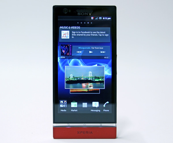
The 4-inch WhiteMagic screen offers great legibility outdoors and Sony’s Bravia engine makes sure colour reproduction is spot on. At 960x540 pixels it delivers 275 pixels per inch, which is not quite on par with Apple’s Retina screens or 720p screens used in flagship Android phones. However, it is still great, especially considering that most 4-inch phones feature WVGA screens. Thanks to the additional white subpixel, the screen delivers a whopping 935 nits, making it a truly great screen to use even in bright daylight.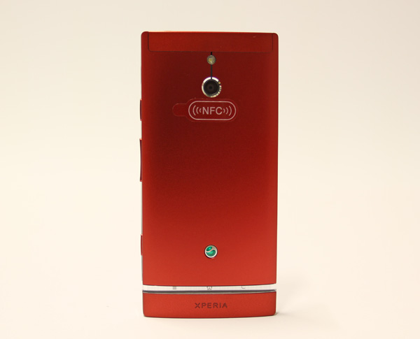
Due to the aluminium shell, there is no way to access the battery and the micro SIM slot is on the left hand side, along with micro USB and micro HDMI ports. Unlike the Xperia S, the Xperia P does not feature protective flaps on the connectors, which is a good thing in our book.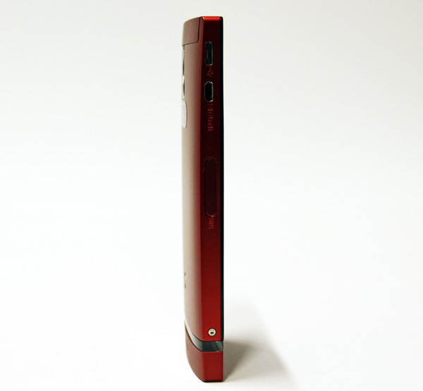
The power button, volume rocker and camera button are located on the right. Unlike most vendors, Sony is still offering a dedicated shutter button on most phones and we believe this is a good call on Sony’s part.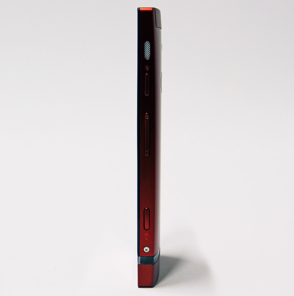
On the top you’ll find a standard 3.5mm audio jack and there are no connectors on the bottom, which is hardly surprising as the plastic cap on the bottom of the phone is purely decorative. 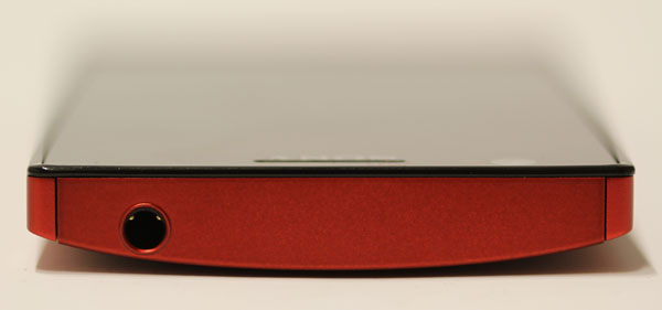
The 8-megapixel camera, powered by a Sony Exmor sensor with backlight illumination, is neatly centered at the back, along with an LED flash.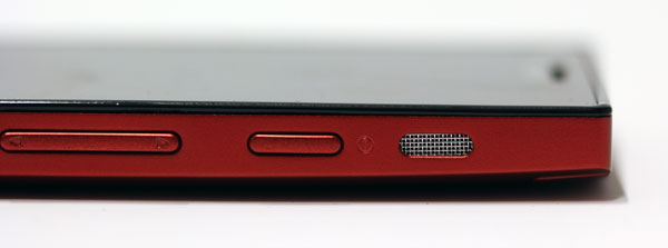
The aluminium finish is not as smudge proof as matte plastics, but it is still much better than glossy plastics used on most mid-range phones. However, the bottom cap and a small portion of the top are plastic. There is nothing wrong with these bits, build quality is great and Sony matched the colours well, but in some circumstances they reflect light a bit different than the aluminium back, as you can see in the photos.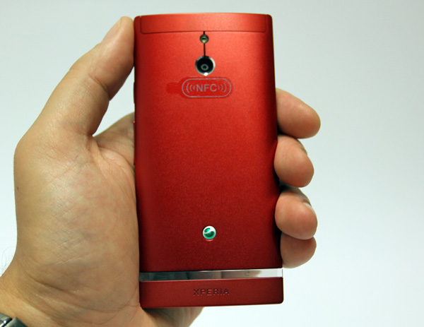
Overall, Sony did a great job in the design department and the silver model is particularly attractive, as most vendors are going with white and black colour options nowadays. Fashionistas are free to pick up a red version, while the business casual crowd can go for the understated black version.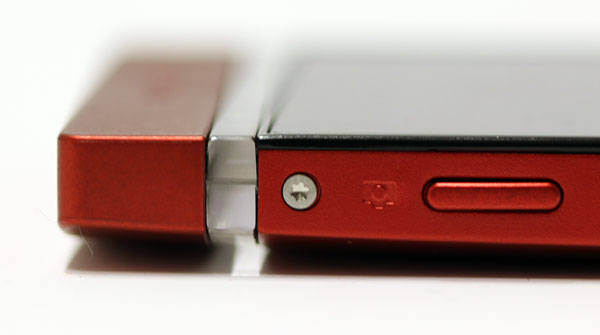
User Interface, Software
It is not all smooth sailing for the Xperia P, or the rest of Sony’s Xperia line for that matter. The Xperia P still ships with Gingerbread, although it should receive an ICS update by the end of the month. Luckily, Sony did not go overboard with its skin.
The Timescape UI is pretty straightforward and it’s not tacky or too demanding. There are some issues, though. The keyboard could have been a bit better, there is a lot of unnecessary bloat, but this is true of practically all Android phones nowadays.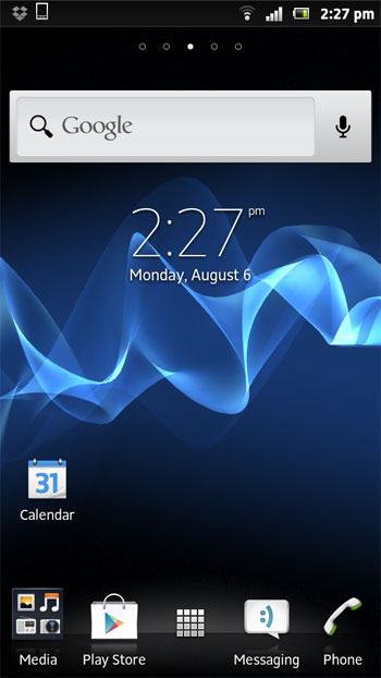
The UI has a more or less standard five-pane layout and it comes with a few clever Sony widgets and folder support, which is not something you usually see on Gingerbread phones. 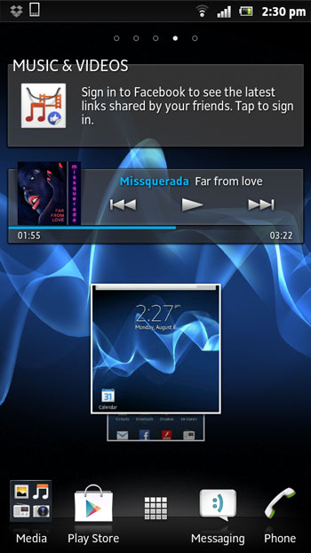
Pinching out takes you to Overview mode, which places all widgets and shortcuts in a single screen. It is an interesting approach, as most vendors simply display five or seven panes when you pinch to zoom. Although we are not huge fans of Android customizations, we have to admit that some Sony tricks and widgets are quite interesting, namely the music player widget and settings widgets. 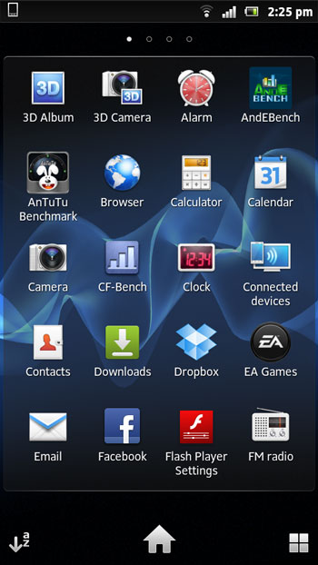
However, we really don’t see much point it wasting time talking about the UI and browser, as the ICS update is just days away. Sony is mum on potential Jelly Bean updates for current generation Xperias, so we are not sure when the update will land, or whether all phones will get it.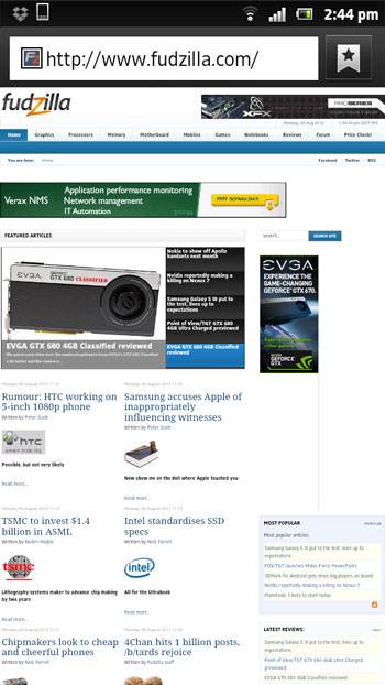
Performance, Camera
Not surprisingly, Sony put its visual expertise to good use and came up with a pretty good camera for the Xperia P. Although it is a mid-range device, the 8-megapixel snapper is capable of delivering some pretty good shots in daylight, but it struggles indoors and in poor lighting. The camera UI can appear a bit too cluttered from time to time, but it also offers a wide range of options. There are plenty of predefined scenes to choose from, along with a myriad of additional settings, two panorama modes, including a 3D sweep panorama and a sweep multiangle mode.
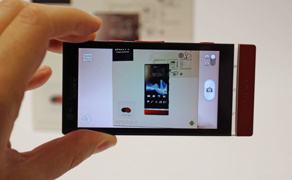
Of course, if you don’t want to waste time or just can’t be bothered, you can simply squeeze the hardware shutter key straight from the lock screen and snap a quick one. Speaking of speed, although the dedicated shutter key comes in handy, the Xperia P lacks the muscle for fast continuous shooting, but you probably guessed that by looking at the spec.
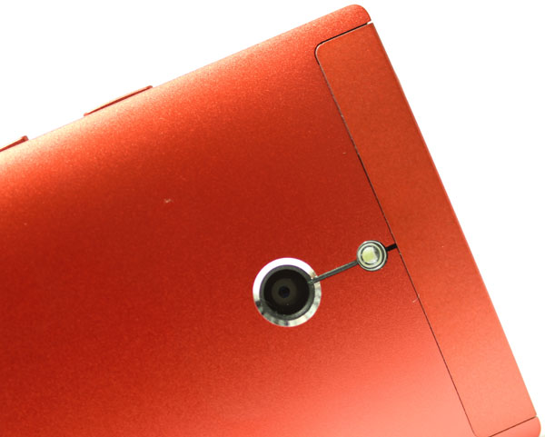
Image quality is pretty good, although indoor shots tend to suffer from a bit too much noise. Video is another matter. Although the Xperia P supports 1080p video, it is unimpressive. The framerate does not seem to be the issue, but there is just too much compression, resulting in quite a few artifacts. The same issues are present in 720p.
Although the Xperia P can’t match the performance of quad-core or Snapdragon S4 based phones, it still packs a decent punch for a mid range device. The numbers aren’t spectacular, the Xperia P is roughly on par with LG’s old Optimus 2X and in some tests it even comes close the Galaxy Nexus. Graphics performance in some benchmarks is rather disappointing, so if you are into mobile gaming, you should probably look elsewhere.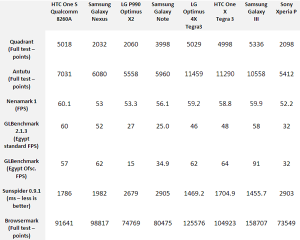
Overall it’s a decent showing for the Xperia P, but it could have been better. For a fashionable mid-range phone it does well, but here’s the problem - Sony uses the exact same 1GHz U8500 chip in the dirt cheap Xperia U and Xperia Sola. This basically means that consumers can get similar performance from a €200 or €250 device.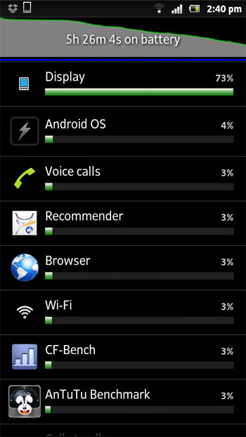
Although the U8500 leaves much to be desired in terms of performance, it seems to be a very power efficient chip. Coupled with the innovative and equally power efficient WhiteMagic display, the U8500 helps the Xperia P get decent battery life out of its 1350mAh power pack. However, battery life is still rather limited and you will be looking for a socket by the end of the day. Luckily, Sony claims that just 10 minutes of charging will provide the phone with enough juice for an hour of talk time.
Conclusion
The Xperia P is a mixed bag and it’s really not an ideal phone for everyone. Consumers who insist on a fast processor and huge screen might want to look elsewhere. The Xperia P lacks muscle and battery life is unimpressive, so it's really not going after power users.
However, this does not mean that it's a bad phone, far from it. What it lacks in sheer performance and bench figures, the Xperia P makes up in other departments. Basically if you think that good looks and a top notch camera are more important, then the Xperia P starts to make sense, a lot of sense. It features a great screen tucked away under an aluminium body, 16 gigs of storage and it has what it takes to unnerve the competition. 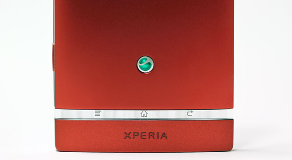
In this case, beauty is not just skin deep and overall the Xperia P is nice package, although it could have been a lot better with a slighly bigger battery and a higher clocked processor.
It sells for €320 to €350 in Euroland, which sounds like a fair deal if you hate plasticky phones. The only trouble is that the Xperia S can be yours for just a bit more, and so can the Galaxy Nexus.
Review sample provided by Ditech.


