Index
User Interface, Software
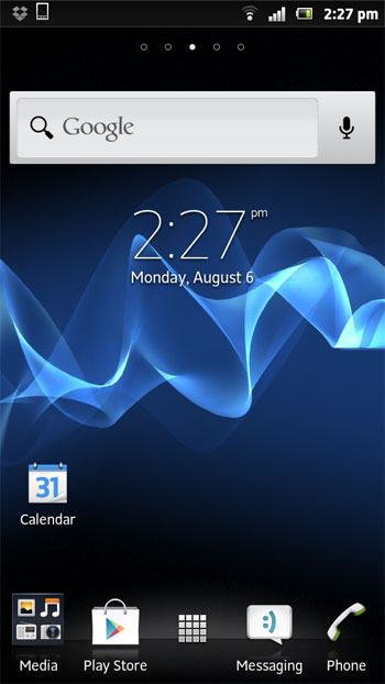
It is not all smooth sailing for the Xperia P, or the rest of Sony’s Xperia line for that matter. The Xperia P still ships with Gingerbread, although it should receive an ICS update by the end of the month. Luckily, Sony did not go overboard with its skin.
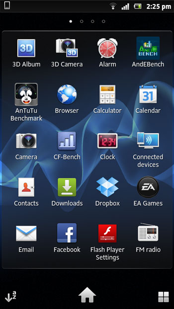
The Timescape UI is pretty straightforward and it’s not tacky or too demanding. There are some issues, though. The keyboard could have been a bit better, there is a lot of unnecessary bloat, but this is true of practically all Android phones nowadays.
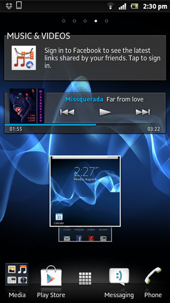
The UI has a more or less standard five-pane layout and it comes with a few clever Sony widgets and folder support, which is not something you usually see on Gingerbread phones. 
Pinching out takes you to Overview mode, which places all widgets and shortcuts in a single screen. It is an interesting approach, as most vendors simply display five or seven panes when you pinch to zoom. Although we are not huge fans of Android customizations, we have to admit that some Sony tricks and widgets are quite interesting, namely the music player widget and settings widgets. 
However, we really don’t see much point it wasting time talking about the UI and browser, as the ICS update is just days away. Sony is mum on potential Jelly Bean updates for current generation Xperias, so we are not sure when the update will land, or whether all phones will get it.


