Index
Review: Snapdragon 615 ready for fancy dress party
The ZTE Blade S6 is the Chinese company’s latest crack at the mid-range smartphone segment, but is its fancy body writing cheques its internals can’t cash?
ZTE has been around for a while. In fact, the company was churning out mobile phones years before some of the current market leaders came into being. However, years of experience didn’t help ZTE maintain a competitive edge, so the company was the only big Chinese brand to lose market share last year, although it did manage to ship about 50 million phones.
Refreshed Blade series models, along with the recently announced Nubia Z9 series, are supposed to turn ZTE’s fortunes around. The Nubia brand is reserved for flagships, while value products end up with Blade branding. The Blade S6 is one such product and in many respects it feels like a smartphone designed by a corporate committee, assembled to design and deliver a mid-range device on budget, on time.
This is not necessarily a bad thing, because the end result is a well balanced and affordable 5-inch phone with a 720p display, 2.5D curved glass, octa-core Snapdragon 615 processor, 2GB of RAM and 16GB of internal storage. You also get a 13-megapixel camera, Android 5.0, LTE Cat 4, dual SIM and micro SD slot, all packed in a sleek 7.7mm thick body.
This is perhaps why ZTE chose to dispense with some bells and whistles, as keeping the price near the sweet spot was obviously a factor. The Blade S6 sells for $249 with free shipping, or about €229 from Gearbest's EU stock. So let’s see where ZTE’s accountants drew the line and decided to pinch pennies.
Design and Build Quality
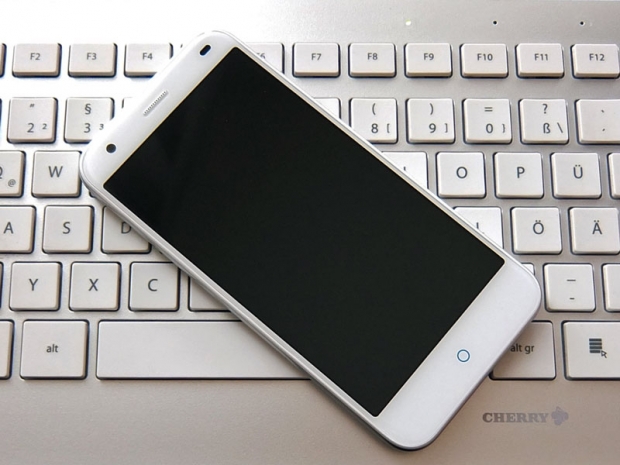
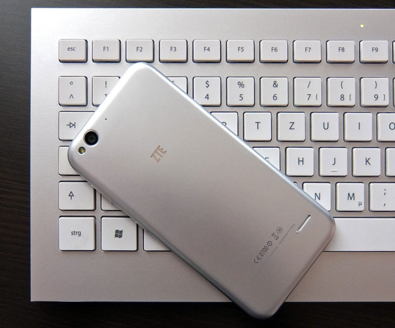
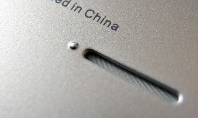
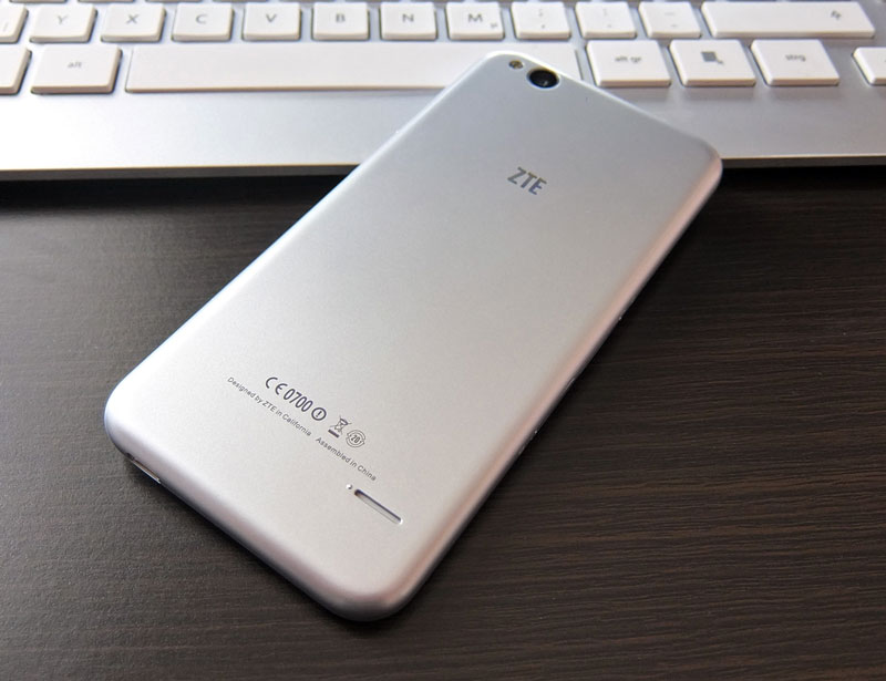
As you can plainly see, the Blade S6 “borrows” its design from the iPhone 6. It’s a bit bigger, there’s no physical navigation button, no protruding camera, the speaker isn’t located at the bottom and since it’s plastic, there are aerial cut-outs on the back.
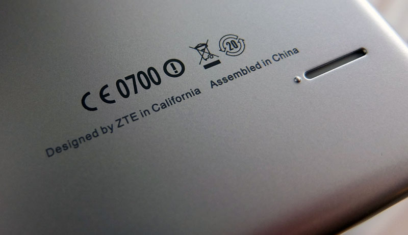
However, at the end of the day it has iPhone clone written all over it. In fact, ZTE isn’t just copying the Jony Ive’s design, it’s also trolling Apple with the “Designed by ZTE in California, Made in China” inscription on the back.
While some people like designs inspired by Apple, we fear the look is doing the Blade S6 more harm than good in western markets. Unlike most iPhone clones, this is actually a pretty nice mid-range device in its own right. The phone is available in silver and a pink version is on the way, too, but we think ZTE would have been better off had it decided to offer a few additional colour options for people who don’t want to feel like they’re getting an iPhone clone.
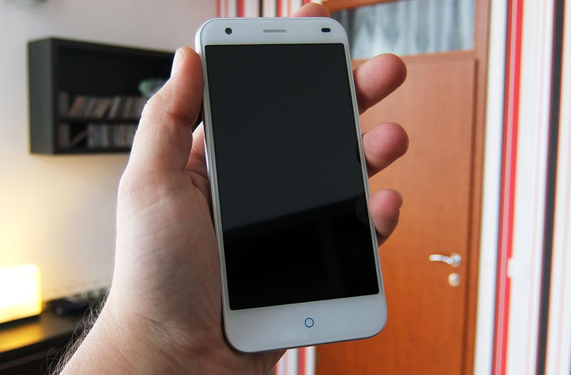
The good thing about copying Apple is that you do end up with pretty good ergonomics and a sleek look. The Blade S6 measures 144 x 70.7 x 7.7 mm (5.67 x 2.78 x 0.30 in) and weighs 134g, which is relatively slim and light for a 5-incher. There are no sharp edges and the curved glass helps make the phone appear (and feel) thinner than it really is. It’s very comfortable to hold, smooth as silk.
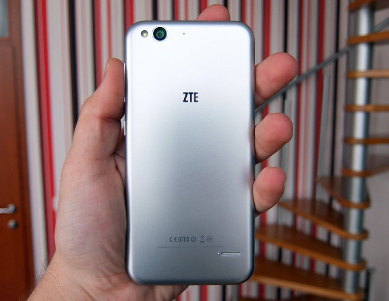
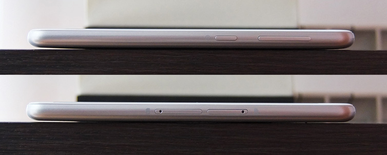
Perhaps a bit too smooth, as the body doesn’t offer a lot of grip. The volume rocker and power button are located on the right side. We have no complaints about their quality or design, tactile feedback is excellent and the finish is good.
Like we said, the back is plastic, it’s not aluminium although it tries to play the part. It’s not removable, either, hence neither is the 2400mAh battery. We’ve learned to live with non-removable batteries and unibody plastic/polycarbonate designs, especially when they’re done right, but we feel ZTE could have done a somewhat better job. The plastic doesn’t feel much better than a run of the mill removable cover, although you’d expect it to thanks to its unibody design. This is our biggest gripe with the ZTE Blade S6 – the back of the phone doesn’t touch the internals, so there’s a bit of flex when you apply pressure near the centre. This is rather odd, since it could have been resolved with a couple of reinforcement points on the inside of the shell, but someone obviously overlooked this detail.
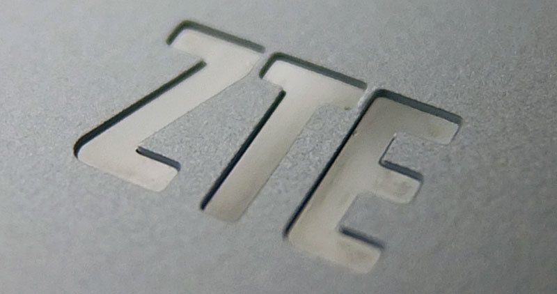
The shell itself feels sturdy and there’s not a lot of flex to the body. The silver-coated plastic isn’t thin. Judging by the speaker and 3.5mm cut-outs, the shell is about a milimetre thick, much more than your average plastic back cover. Although we’re not fans of the faux aluminium look, the finish does have one thing going for it – it doesn’t attract a lot of fingerprints and smudges, so you won’t have to wipe it every second. In fact, just placing it in a tight pocket should get rid of most fingerprints.
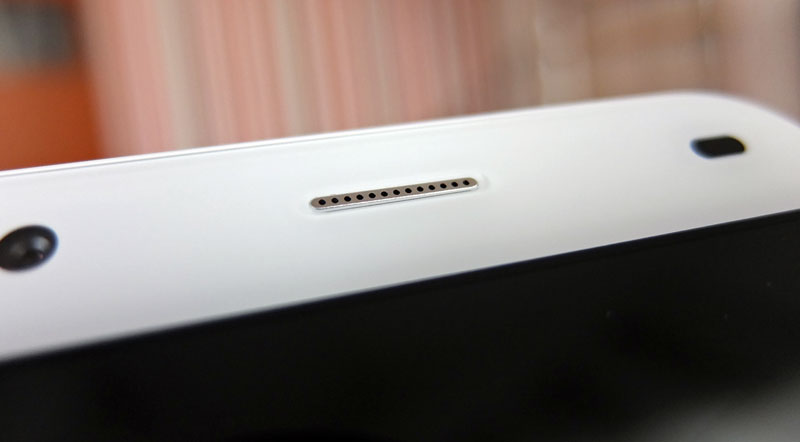
As for ZTE’s choice of colours, we believe a few more options would have been nice, like an all-white one, or maybe a colourful, pastel option. Of course, then it wouldn’t look so much like an iPhone, but that would be a plus for many users.
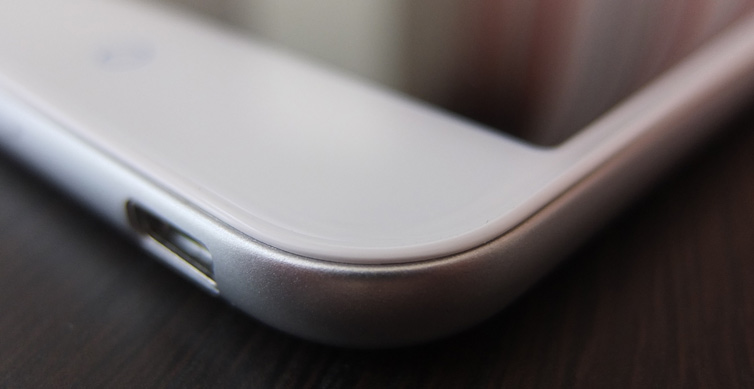
Although we’re not entirely happy with the back, we must not forget that up until a couple of years ago, consumers got a similar tactile feeling on some flagship phones. Placed next to a Galaxy S5, the sides of the ZTE Blade S6 look and feel premium, but the back lets it down. If you prefer to use some sort of silicon case on your device, this is really not an issue. The fact that the 2400mAh battery is not replaceable may be a concern for some users, but thanks to the frugal chipset, we got decent results.
ZTE Blade S6 Specs and Performance
The ZTE Blade S6 is a mid-range device, but unlike most Chinese phones in this price range, it’s not based on MediaTek silicon. The SoC of choice is Qualcomm’s Snapdragon 615, with four Cortex-A53 cores clocked at 1.5GHz and four additional A53 cores clocked at 1.0GHz. If you were thinking the choice of Qualcomm’s chipset also means that the phone can use every LTE network out there – think again. The Blade S6 can’t use many North American LTE bands, but European consumers should have no trouble with it. Of course, make sure to do your homework and check compatibility prior to making a purchase.
Here is the full ZTE Blade S6 spec:
- SoC: Qualcomm Snapdragon 615, 28nm
- CPU: Eight 64-bit Cortex-A53 cores, 4 x 1.5GHz and 4 x 1.0GHz
- GPU: Adreno 405
- RAM: 2GB
- Storage: 16GB internal, microSD slot up to 64GB
- Display: 5-inch 720p IPS, 2.5D curved glass
- OS: Android 5.0 (MiFavor 3.0 UI)
- Rear camera: 13-megapixel Sony IMX214 sensor, 28mm equivalent lens, f/2.0 aperture
- Front facing camera: 5-megapixel sensor, 80 degree FOV, f/2.2 aperture
- Battery: 2400mAh lithium ion, non-replaceable
- Dimensions: 144 x 70.7 x 7.7 mm (5.67 x 2.78 x 0.30 inches)
- Weight: 134g
- WiFi and Bluetooth: 802.11ac WiFi, Bluetooth 4.0, A2DP, FM radio
- Sensors: ambient light, proximity, gesture, gravity, compass, GPS, A-GPS, GLONASS.
- Network support: GSM+WCDMA+FDD-LTE
- 2G: GSM 850/900/1800/1900MHz
- 3G: WCDMA 900/2100MHz
- 4G: FDD-LTE 800/900/1800/2100/2600MHz
- SIM: dual nano SIM
The spec does not leave a lot of room for complaints, it’s more or less standard for a 2015 mid-range device. One thing missing from the list is NFC support, but the rest of the package looks quite good. It's even got FM radio, which some users still find very useful. Oddly, the radio app does not appear to support RDS.
In terms of performance, the ZTE Blade S6 ends up somewhat slower than similar devices based on MediaTek’s MT6752 octa-core, with all eight cores clocked at 1.7GHz and Mali-T760 graphics. However, Qualcomm’s chip should be more efficient, making it more suitable for thin devices like the Blade S6.
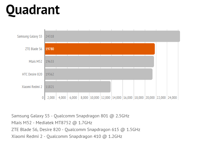
In Quadrant, the Snapdragon 615 does rather well, outpacing the MediaTek MT6752, but other benchmarks clearly favour MediaTek's octa-core.
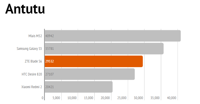
Antutu is a tad more realistic, although it doesn't do justice to the Snapdragon 801 on the Galaxy S5.
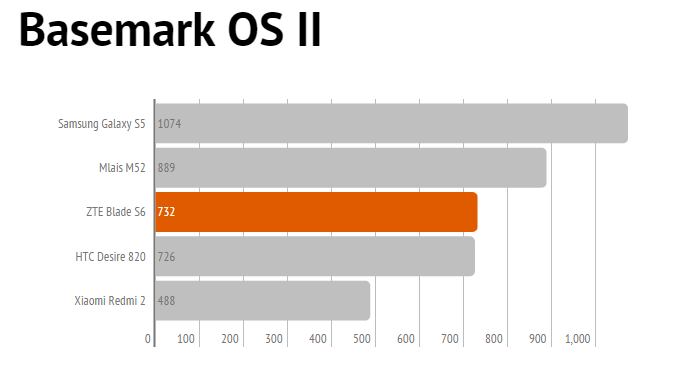
Basemark also favours the MediaTek SoC, but shows nearly identical scores for the Blade S6 and Desire 820, which are based on the same chipset.
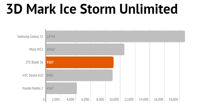
3D Mark Ice Storm is more of the same, but it clearly proves that the Snapdragon 801 has a vastly more powerful GPU than the Snapdragon 615 and MT6752.
Overall, there are no big surprises. The MediaTek MT6752 is marginally faster in most tests, but the Snapdragon 615 should provide somewhat better battery life. The end-user probably won't be able to tell the difference. Both chipsets are quite powerful and more than capable of delivering great performance on a budget. However, if you're into mobile gaming, they're no substitute for a flagship phone with a more powerful GPU and a beefy battery.
We also included the Xiaomi Redmi 2 in our list because it's powered by the Snapdragon 615's little brother – the quad-core Cortex-A53 Snapdragon 410. It's clearly not able to keep up with octa-core parts, but even the little Snapdragon 410 still offers decent performance for entry-level devices.
While we are performance freaks, we must admit mid-range phones are becoming a very good alternative to flagships, offering near-flagship performance at a fraction of the cost.
Audio, Display and Camera Quality
The 5-inch 720p IPS panel is more or less standard, and obviously contrast isn’t on a par with AMOLED panels. As far as colours go, we were rather pleased with what we got, especially indoors. There’s a slightly warm tint to it and the overall quality is pretty good for this type of device. Redeeming features include relatively small bezels for a 5-inch device and good looking sheet of curved glass on top. The panel is not very bright, so it’s not great outdoors, but this is true of most phones in this price range, so we really can’t hold it against the ZTE.
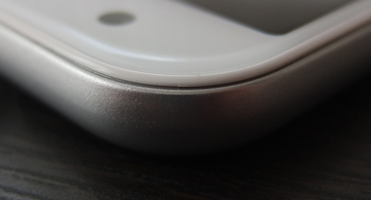
We couldn't escape the feeling that the lovely 2.5D glass also creates a bit more reflections than standard panels, but the curved edges obviously have nothing to do with it. The curves feel quite nice and remind us of the Moto X and iPhone 6 (which is obviously no coincidence). While this is a 720p display, bear in mind that at 5 inches it ends up with a pixel density of 294ppi, which is good enough, especially for a mid-range device.

Overall, very few people will complain about the display.
Audio quality is surprisingly good. Unlike many Chinese phones, the ZTE Blade S6 has a noise cancelling microphone and thanks to years of experience on ZTE’s part, phone functionality is excellent. The microphones are good and call quality is top notch. The rear speaker is loud, although it can sound “tinny” when confronted with a lot of bass.
As for line-out audio output, we were equally impressed. There’s no static, stereo separation is excellent, the amp is relatively powerful and we couldn’t escape the feeling that we were playing around with a high-end device. We’re not sure what sort of components ZTE chose to use, but this is really good news for music lovers, who will also appreciate the microSD slot.
The 13-megapixel camera uses Sony’s IMX214 sensor, which is currently the most prolific imaging sensor in Chinese mid- to high-end phones. In fact, it’s used in much more expensive devices like the OnePlus One and Xiaomi Mi4. It’s not bad, and the fast aperture also helps.
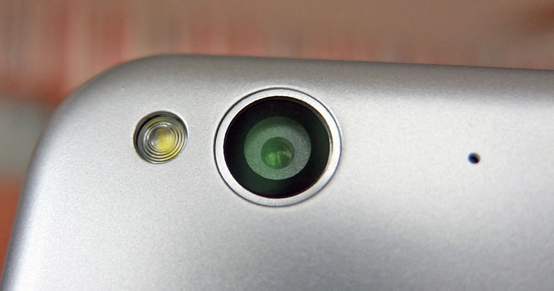
However, ZTE’s camera software leaves much to be desired. The issues are not hardware related – the sensor is good and we suggest you download a third-party camera app, or Google Camera. Interestingly, ZTE ships the phone with Camera360 preinstalled, which leads us to conclude that the company is aware that its own camera app isn’t quite there yet.
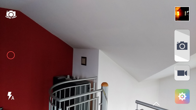
The stock camera app offers two user interfaces; a streamlined, basic UI designed for speed and simplicity, and a more comprehensive Pro mode, which offers quite a bit more control.
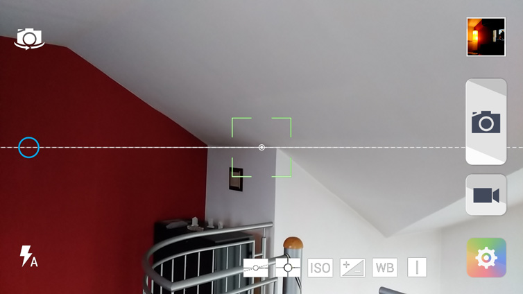
The UI is not bad, but the stock camera app can deliver inconsistent results in some situations. However, the hardware clearly has potential.
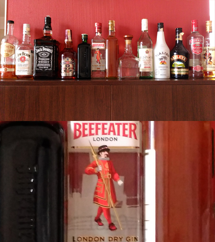
As our 100% crop tests demonstrate, indoor images taken in the Fudzilla cafeteria are quite good, both in daylight and under incandescent lighting.

The ZTE Blade S6 also packs a relatively powerful LED flash.
As far as outdoor shots go, we had a chance to try it out on a perfect day for HDR shots – scattered clouds, just after noon, almost no junkies in the park.
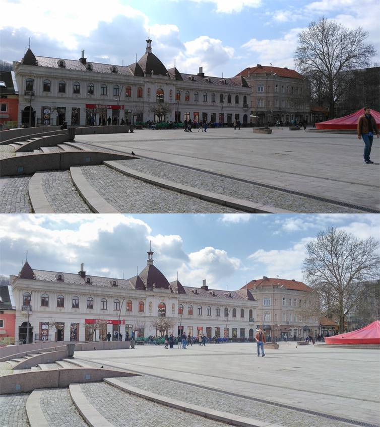
As you can see, the HDR mode is a tad too aggressive on the shadows and "flattens" the image. Still, it does boost dynamic range. Note the clouds in the upper left corner.
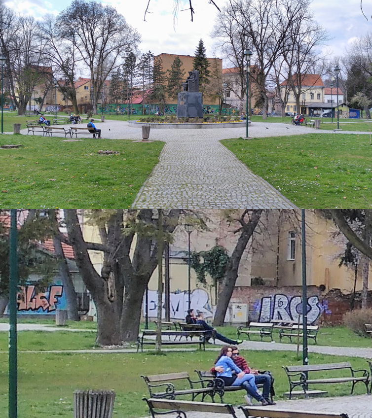
Luckily, HDR does not kill too many details, as this 100% crop shows.
The camera can also capture 1080p video and we have no complaints about the quality, save for the nervous autofocus. The stock app also allows the user to capture high frame rate video and there’s a time lapse mode as well, which is nice.
The 5-megapixel front camera is a wide angle affair and it delivers average results. It’s more than adequate for the occasional video call or selfie, provided you’re not in a dark environment.
OS, UI and Everyday Use
ZTE started shipping the Blade S6 a couple of months ago, but the rollout was limited to certain Asian markets. When it launched, it was practically the only Chinese phone to ship with Android 5.0, and ZTE also claimed it was the first Snapdragon 615 smartphone with Lollipop. Most phones in this segment still ship with Android 4.4, so kudos to ZTE for burning the midnight oil and getting the latest version of Android to a mid-range device.
However, you are not getting stock Android 5.0 – the phone employs a custom skin, dubbed MiFavor 3.0. Like most Chinese brands, ZTE dispensed with the app drawer, so all your apps will end up on one of the main panes. The UI also features squared icons, but the good news is that it’s not too heavy and ZTE didn’t change a whole lot compared to stock Lollipop.
Much of the standard Android 5.0 UI is still there and it seems ZTE took the “if it ain’t broke, don’t fix it” approach. The notification bar, menus and a lot of other Android 5.0 features and apps were left intact – and we like it that way. Of course, since this is Android, you are free to download another launcher.
However, many users probably won’t get the urge to download another launcher because the stock one is pretty good. It’s fast and responsive, and since it still has a lot of Android 5.0 DNA left, so it’s pretty intuitive. We have no complaints about the speed, everything is smooth and the Qualcomm SoC obviously doesn’t break a sweat dealing with the 720p display. The only bug we encountered was the jerky screen brightness slider. For some reason it’s choppy and we’re obviously looking at a software issue, or maybe a firmware glitch with the ambient light sensor.
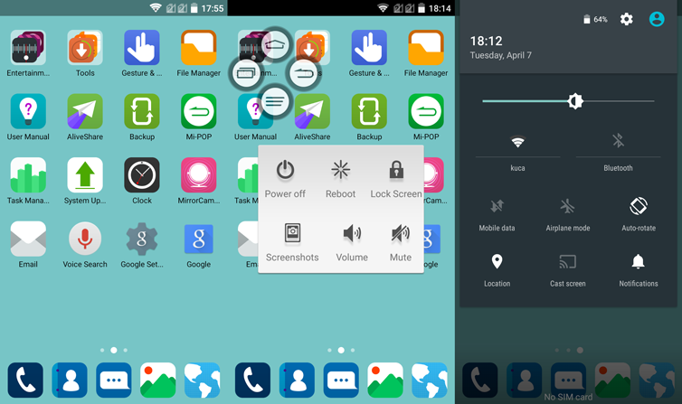
As far as aesthetics go, there’s not much to complain about. ZTE tried to keep the launcher as close to Android 5.0 in terms of overall appearance, so you get a flat design that looks quite good. There are a lot of customisation options as well, and we particularly appreciated the ability of blurring the background with a simple slider. While some puritans may argue that soft, blurred backgrounds have no place in a flat design UI, we like it – it’s a simple and well implemented tweak that allows you to create the impression of an out-of-focus background with a single swipe. However, the choice of stock and downloadable backgrounds is limited, so you might need to get some of your own. Also, the minimalistic, flat UI looks quite good with a simple colour background, but the launcher doesn’t allow you to pick a colour of your own, which is quite odd. You just have a range of predefined colours and the ability to download (!) a few more colours.
ZTE includes a fair amount of bloatware on the device, but it’s not too bad since you can get rid of most of it. There are a few nifty features as well. You can tweak the capacitive button layout to match your personal preference and loads of gestures are supported. Mi-POP is another odd feature that could come in handy. It basically places an easy to access bubble on the screen, which is supposed to easy one-handed operation. We feel it makes more sense on the bigger Blade S6 Plus, with a 5.5-inch screen.
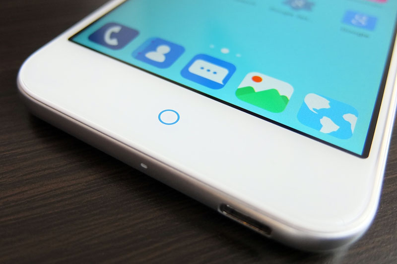
By default, the back button is located left of the home button, while the menu button is on the right, but you can swap them if you prefer. The secondary buttons are not visible when the phone is locked, while the central home button also doubles as a notification LED (blue only, this is not an RGB LED). You access the app switcher by a long press on the menu button, which reveals a standard Android 5.0 carousel, featuring recently used apps and Chrome tabs.
Some of the gestures included on the ZTE Blade S6 are quite gimmicky, but others are not. You can launch the camera by lifting the phone up in landscape mode and pressing the volume rocker, you can shake the phone to turn on the LED light (or launch something else), cover the screen to mute a call or alarm, flip the device to mute it and so on. All these gestures are part of what ZTE calls Smart Sense. Perhaps the most useful and simple features is the phone’s ability to detect when it’s placed into a pocket or purse, and automatically lock the screen.
All in all, ZTE’s UI is not bad at all and we like the fact that much of the Android 5.0 look and feel is still there. If you prefer the stock look, you can get even closer to it by installing Google’s camera, launcher and keyboard apps. This should give you a Nexus-like feel in just a few steps. We think this was a good call on ZTE’s part – the company experimented with a few additional features, but it did so without wrecking the UI in the process.
As we pointed out earlier, this is not a device for North American markets due to network limitations. However, Europeans should have no problems with it – we know we didn’t. However, we still feel LTE on entry-level and mid-range devices still isn’t a must-have feature, since most people who buy them off-contract probably won’t use it anyway.
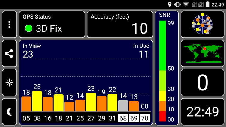
A number of readers have expressed concerns about GPS quality on Chinese phones, but the ZTE performs admirably. We were able to get an indoor lock in a matter of seconds, and the accuracy was good enough to guide a JDAM down someone's chimney, like Santa from hell.
As for the battery, the results were average. While the Snapdragon 615 is supposed to be slightly more efficient than competing octa-core solutions, the 2400mAh battery is no miracle worker. Of course, it all depends on how you use the device, but chances are you’ll get a full day on a single charge with moderate to heavy use. You are basically looking at about six hours of on-screen time.
We took a look at other Snapdragon 615 devices and most of them ship with similar batteries. Sony’s Xperia M4 Aqua has a 2400mAh battery, while the Galaxy Alpha A7 and HTC Desire feature 2600mAh batteries with larger, 5.5-inch screens. With that in mind, ZTE’s 2400mAh battery doesn’t sound bad at all.
Conclusion
The ZTE Blade S6 is an interesting package – it’s a good all-round performer, but it doesn’t stand out in any department. Some may argue that this is sort of the point of mid-range devices, and we feel ZTE just wanted to design a straightforward phone with a good price tag. There’s nothing wrong with that and we like what they came up with.
The hardware is good and we were particularly pleased with the audio quality, unobtrusive UI with Android 5.0 overtones, and the compact design with curved glass. The latter is a mixed bag. The smooth design results in an attractive device that looks and feels light and comfortable. However, the iPhone look won’t be doing it many favours among some consumers. The 7.7mm plastic body feels robust, save for the odd back issue that could have been resolved easily. The finish is fingerprint resistant, but additional colour options that would distance it from the iPhone look would have been a nice touch. While unoriginal, the ZTE Blade S6 leaves the aesthetic impression of a somewhat more expensive device.
The Snapdragon 615 SoC should be sufficient for most users. After all, it delivers roughly the same performance as a 2013 flagship phone and it’s used in much pricier models like the Samsung Galaxy Alpha A7. It’s a 64-bit part running 64-bit Android 5.0, which wasn’t ruined by ZTE’s launcher, and let’s not forget about the 2GB of RAM and 16GB of internal storage. The camera hardware is pretty good, although it feels let down by the stock software.
In terms of value, the Blade S6 compares favourably to similar big-brand devices – it retails for $249 in Asian markets, so you can get two or three for the price of a single flagship phone. Compared to other Snapdragon 615 devices out there, the ZTE is significantly cheaper than the HTC Desire 820, or the recently announced Sony Xperia M4 Aqua. In fact, the Blade S6 costs just a tad more than a similarly spec’d Moto G, with an inferior camera and SoC. The biggest problem facing the ZTE Blade S6, and indeed all mid-range phones, is that last year’s flagships go for about $100 more than the average mid-range phone. Since it’s really not an option for US consumers, let’s take a look at the European price. Gearbest, our principal provider of Chinese review samples, sells it for €229 with free shipping from EU stock, so European consumers don’t have to worry about customs and delivery times. The ZTE is in the same price range as the Acer Liquid Jade Z Plus, Samsung Galaxy Alpha A3, HTC Desire 620 and the Huawei Ascend G7, but it has a somewhat better spec than all of them.
The 5.5-inch ZTE Blade S6 Plus went on sale a couple of days ago and it features the same spec, with a bigger screen and 3000mAh battery. In case you think a 25% bigger battery is worth the extra investment, the Plus version sells for $299/€275.
The ZTE Blade S6 is a solid device and offers good value for money, but with a bit more refinement and additional colour options, it could have been even better, with very little effort on ZTE’s part. That’s perhaps our biggest complaint – with a bit more tender loving care and attention to detail, ZTE could have ended up with an exceptional mid-range device at virtually the same price point.
ZTE Blade S6 Pros and Cons
Pros:
- Android 5.0 out of the box
- Excellent audio, on par with flagship devices
- MiFavor UI 3.0 is clean and flat, features a lot of Android 5.0 stock elements
- Thin and smooth, fingerprint resistant design topped off with curved glass
- Fairly good price/performance ratio
- Sony 13-megapixel camera
Cons:
- Lack of colour options
- Stock camera software delivers inconsistent results
- Unoriginal design
- Odd flex issue on back cover
- No NFC support

