Index
OS, UI and Everyday Use
ZTE started shipping the Blade S6 a couple of months ago, but the rollout was limited to certain Asian markets. When it launched, it was practically the only Chinese phone to ship with Android 5.0, and ZTE also claimed it was the first Snapdragon 615 smartphone with Lollipop. Most phones in this segment still ship with Android 4.4, so kudos to ZTE for burning the midnight oil and getting the latest version of Android to a mid-range device.
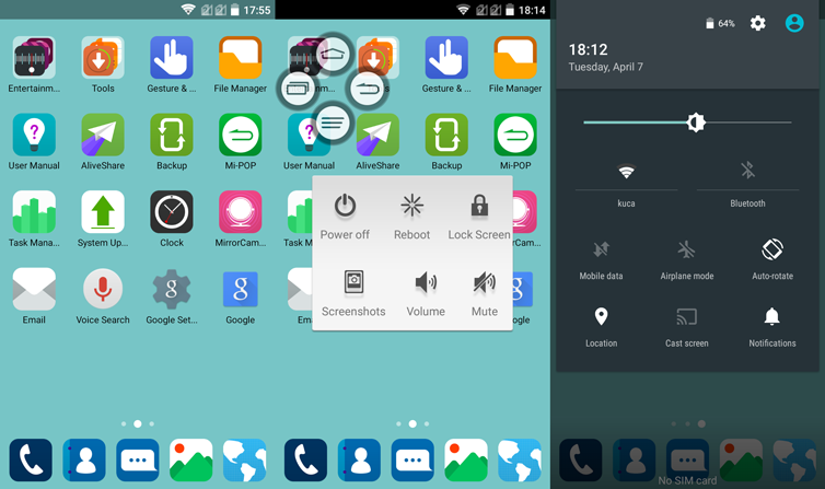
However, you are not getting stock Android 5.0 – the phone employs a custom skin, dubbed MiFavor 3.0. Like most Chinese brands, ZTE dispensed with the app drawer, so all your apps will end up on one of the main panes. The UI also features squared icons, but the good news is that it’s not too heavy and ZTE didn’t change a whole lot compared to stock Lollipop.
Much of the standard Android 5.0 UI is still there and it seems ZTE took the “if it ain’t broke, don’t fix it” approach. The notification bar, menus and a lot of other Android 5.0 features and apps were left intact – and we like it that way. Of course, since this is Android, you are free to download another launcher.
However, many users probably won’t get the urge to download another launcher because the stock one is pretty good. It’s fast and responsive, and since it still has a lot of Android 5.0 DNA left, so it’s pretty intuitive. We have no complaints about the speed, everything is smooth and the Qualcomm SoC obviously doesn’t break a sweat dealing with the 720p display. The only bug we encountered was the jerky screen brightness slider. For some reason it’s choppy and we’re obviously looking at a software issue, or maybe a firmware glitch with the ambient light sensor.

As far as aesthetics go, there’s not much to complain about. ZTE tried to keep the launcher as close to Android 5.0 in terms of overall appearance, so you get a flat design that looks quite good. There are a lot of customisation options as well, and we particularly appreciated the ability of blurring the background with a simple slider. While some puritans may argue that soft, blurred backgrounds have no place in a flat design UI, we like it – it’s a simple and well implemented tweak that allows you to create the impression of an out-of-focus background with a single swipe. However, the choice of stock and downloadable backgrounds is limited, so you might need to get some of your own. Also, the minimalistic, flat UI looks quite good with a simple colour background, but the launcher doesn’t allow you to pick a colour of your own, which is quite odd. You just have a range of predefined colours and the ability to download (!) a few more colours.
ZTE includes a fair amount of bloatware on the device, but it’s not too bad since you can get rid of most of it. There are a few nifty features as well. You can tweak the capacitive button layout to match your personal preference and loads of gestures are supported. Mi-POP is another odd feature that could come in handy. It basically places an easy to access bubble on the screen, which is supposed to easy one-handed operation. We feel it makes more sense on the bigger Blade S6 Plus, with a 5.5-inch screen.

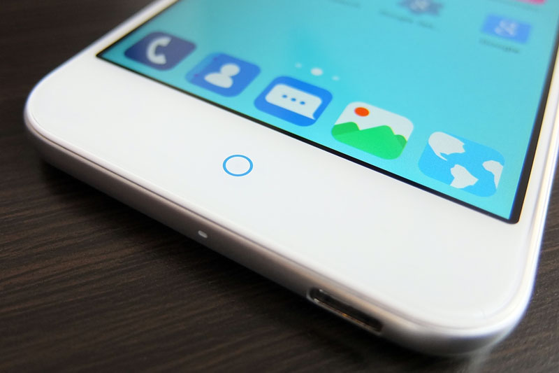
By default, the back button is located left of the home button, while the menu button is on the right, but you can swap them if you prefer. The secondary buttons are not visible when the phone is locked, while the central home button also doubles as a notification LED (blue only, this is not an RGB LED). You access the app switcher by a long press on the menu button, which reveals a standard Android 5.0 carousel, featuring recently used apps and Chrome tabs.
Some of the gestures included on the ZTE Blade S6 are quite gimmicky, but others are not. You can launch the camera by lifting the phone up in landscape mode and pressing the volume rocker, you can shake the phone to turn on the LED light (or launch something else), cover the screen to mute a call or alarm, flip the device to mute it and so on. All these gestures are part of what ZTE calls Smart Sense. Perhaps the most useful and simple features is the phone’s ability to detect when it’s placed into a pocket or purse, and automatically lock the screen.
All in all, ZTE’s UI is not bad at all and we like the fact that much of the Android 5.0 look and feel is still there. If you prefer the stock look, you can get even closer to it by installing Google’s camera, launcher and keyboard apps. This should give you a Nexus-like feel in just a few steps. We think this was a good call on ZTE’s part – the company experimented with a few additional features, but it did so without wrecking the UI in the process.
As we pointed out earlier, this is not a device for North American markets due to network limitations. However, Europeans should have no problems with it – we know we didn’t. However, we still feel LTE on entry-level and mid-range devices still isn’t a must-have feature, since most people who buy them off-contract probably won’t use it anyway.

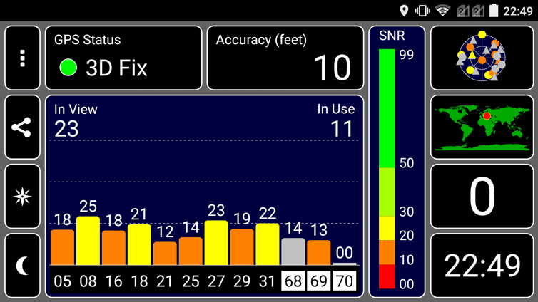
A number of readers have expressed concerns about GPS quality on Chinese phones, but the ZTE performs admirably. We were able to get an indoor lock in a matter of seconds, and the accuracy was good enough to guide a JDAM down someone's chimney, like Santa from hell.
As for the battery, the results were average. While the Snapdragon 615 is supposed to be slightly more efficient than competing octa-core solutions, the 2400mAh battery is no miracle worker. Of course, it all depends on how you use the device, but chances are you’ll get a full day on a single charge with moderate to heavy use. You are basically looking at about six hours of on-screen time.
We took a look at other Snapdragon 615 devices and most of them ship with similar batteries. Sony’s Xperia M4 Aqua has a 2400mAh battery, while the Galaxy Alpha A7 and HTC Desire feature 2600mAh batteries with larger, 5.5-inch screens. With that in mind, ZTE’s 2400mAh battery doesn’t sound bad at all.


