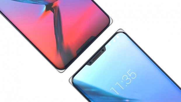
People are complaining about one notch, so let’s give them 50 percent more to complain about. The design doesn’t look that bad, but we are puzzled about the corners of the phone. They look transparent and the whole phone seems like it is made in Unibody, one piece of glass. The phone design was unvieled at the IF world design guide.
This looks like a concept device and there is a big chance that it will never make it to the market. It is puzzling anyone uses the Iceberg code name. It is like the firm has never seen Leonardo Di Caprio freezing in the water and scaring girls for life.
The market is thriving for less of a bezel and having two notches might be a step in that direction, but is is questionable if people will find the button notch useful. The top one, we get it, you need a space to put a front facing camera/other sensors and a speaker, but the bottom one is puzzling.


