Index

Review: Aluminium lady in red
In the aftermath of its not-so-painful breakup with Ericsson, consumer electronics giant Sony is in the process of trying to reinvent itself and aggressively reenter the smartphone space. It is doing so in style, Sony’s NXT generation Xperia devices are some of the best looking Android handsets on the market, but simply getting the design right is not enough in today’s highly competitive smartphone market.
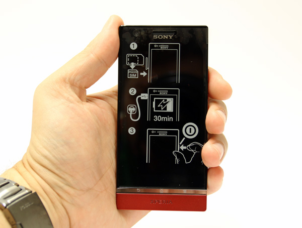
The Xperia P is Sony’s stab at the mid-range market and it sits between the Xperia S in the high end and the Xperia U in the low end. It’s a good looking piece of kit clad in an aluminium shell and powered by a dual-core 1GHz Novathor U8500 chip, courtesy of ST Ericsson. The sleek industrial design and aluminium finish sets it apart from the competition and overall Sony’s designers did a pretty good job. Even the packaging tries to be different, it’s incredibly thin and flat, reminiscent of a paperback book rather than a run of the mill smartphone package. 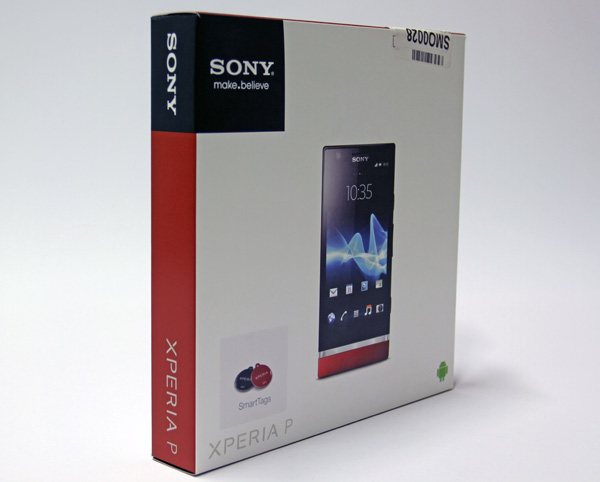
The box includes a standard microUSB cable, charger, a couple of NFC tags and headphones. The in-ear type headphones offer decent audio quality, but we really appreciate the fact that Sony bundled three sets of earbuds and a simple plastic clip, which always comes in handy.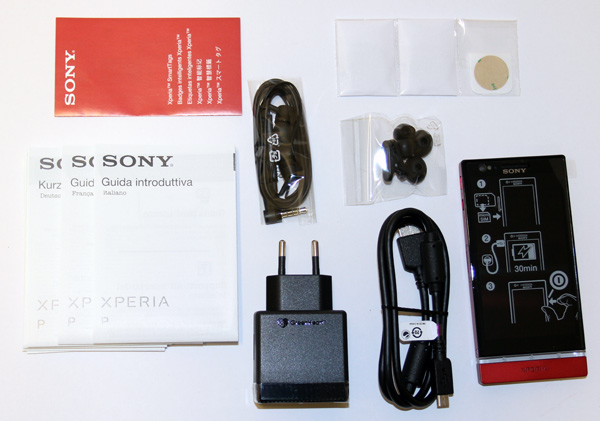
The Xperia P is available in silver, black and red, but there's also talk of a pink version. We got the red version, and we are guessing our female readers will appreciate it. Both of them.
While Sony's flagship Xperia S packs a 4.3-inch 720p screen, the mid-range Xperia P features a 4-inch 960x540 display. It uses Sony’s WhiteMagic technology, which basically means that every pixel features an additional white subpixel. It might sound like a marketing gimmick, but the extra pixel helps keep power consumption down, while at the same time improving legibility in daylight conditions. The results are pretty good and the screen looks great even in near direct sunlight. 
Although it features a 4-inch screen, the Xperia P is not as compact as you might expect. It measures 122 x 59 x 10.5mm and weighs 120g. The boxy design only emphasizes the 10mm girth and despite its bulk it only features a 1350mAh battery. The battery is not user replaceable and there is no microSD slot. Since the phone packs 16GB, many users would appreciate some expansions options. However, Sony opted for an aluminium body that doesn’t allow you to access the insides. This also means that the micro SIM slot is located on the side. 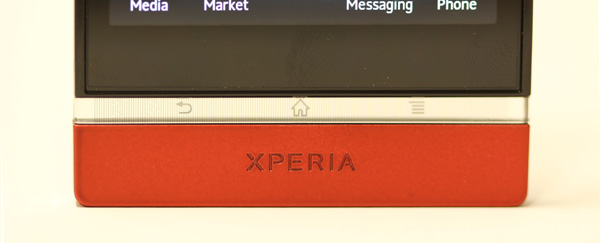
The Xperia P is powered by a Novathor U8500 dual-core SoC with Mali-400MP graphics. Sony uses the same chipset on the dirt cheap Xperia U and it sounds somewhat underpowered for a mid-range phone, but it is practically as fast as last year’s high-end phones. The phone also has 1GB of RAM, so the spec should be enough for snappy performance, in theory at least. However, Sony ships the Xperia P with Android 2.3, not exactly known for snappy performance. An ICS update should arrive this month though, but it is still disappointing to see a two year old OS on a new mid range phone.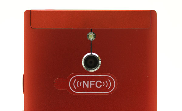
In keeping with tradition, Sony endowed the Xperia P with a pretty nice 8-megapixel camera, along with a front-facing camera. There’s also a dedicated camera shutter button, which is welcome touch. Also on board, an old fashioned FM radio, something that we’ve learned to expect from Sony. HDMI is also a nice touch, as many vendors are ditching HDMI on their phones. The Xperia P also features NFC support and ships with a couple of NFC smart tags.


