Index
First Impression
The Xperia P feels like a class act for a mid-range device. Build quality is top notch and it is nice to see what is practically an aluminium unibody in this price bracket. Like the rest of the NXT series, the Xperia P features a transparent navigation band, which houses the antennae and three navigation buttons. It is a pretty clever way of giving the phone a bit personality and in case you don’t find too tacky, it is a nice touch.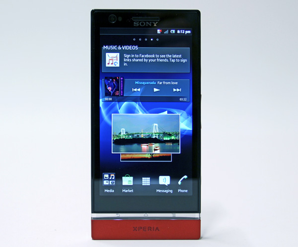
The 4-inch WhiteMagic screen offers great legibility outdoors and Sony’s Bravia engine makes sure colour reproduction is spot on. At 960x540 pixels it delivers 275 pixels per inch, which is not quite on par with Apple’s Retina screens or 720p screens used in flagship Android phones. However, it is still great, especially considering that most 4-inch phones feature WVGA screens. Thanks to the additional white subpixel, the screen delivers a whopping 935 nits, making it a truly great screen to use even in bright daylight.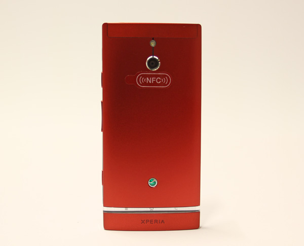
Due to the aluminium shell, there is no way to access the battery and the micro SIM slot is on the left hand side, along with micro USB and micro HDMI ports. Unlike the Xperia S, the Xperia P does not feature protective flaps on the connectors, which is a good thing in our book.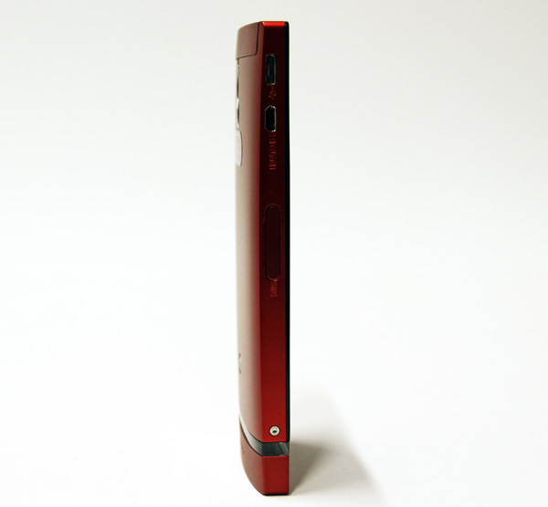
The power button, volume rocker and camera button are located on the right. Unlike most vendors, Sony is still offering a dedicated shutter button on most phones and we believe this is a good call on Sony’s part.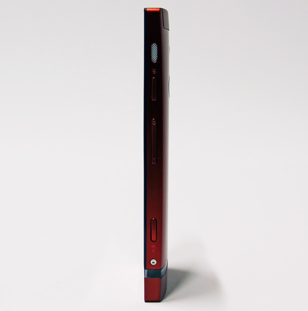
On the top you’ll find a standard 3.5mm audio jack and there are no connectors on the bottom, which is hardly surprising as the plastic cap on the bottom of the phone is purely decorative. 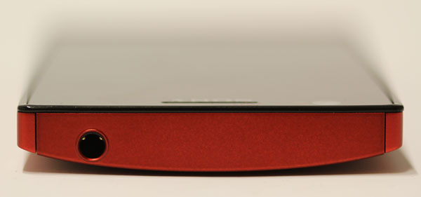
The 8-megapixel camera, powered by a Sony Exmor sensor with backlight illumination, is neatly centered at the back, along with an LED flash.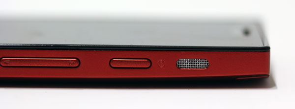
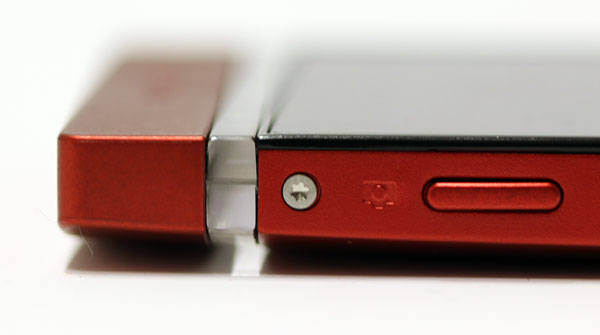
The aluminium finish is not as smudge proof as matte plastics, but it is still much better than glossy plastics used on most mid-range phones. However, the bottom cap and a small portion of the top are plastic. There is nothing wrong with these bits, build quality is great and Sony matched the colours well, but in some circumstances they reflect light a bit different than the aluminium back, as you can see in the photos.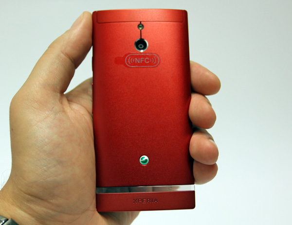
Overall, Sony did a great job in the design department and the silver model is particularly attractive, as most vendors are going with white and black colour options nowadays. Fashionistas are free to pick up a red version, while the business casual crowd can go for the understated black version.