Index
Design and Build Quality
As you can plainly see, the Blade S6 “borrows” its design from the iPhone 6. It’s a bit bigger, there’s no physical navigation button, no protruding camera, the speaker isn’t located at the bottom and since it’s plastic, there are aerial cut-outs on the back.
However, at the end of the day it has iPhone clone written all over it. In fact, ZTE isn’t just copying the Jony Ive’s design, it’s also trolling Apple with the “Designed by ZTE in California, Made in China” inscription on the back.
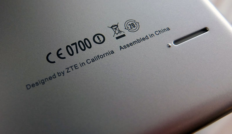
While some people like designs inspired by Apple, we fear the look is doing the Blade S6 more harm than good in western markets. Unlike most iPhone clones, this is actually a pretty nice mid-range device in its own right. The phone is available in silver and a pink version is on the way, too, but we think ZTE would have been better off had it decided to offer a few additional colour options for people who don’t want to feel like they’re getting an iPhone clone.
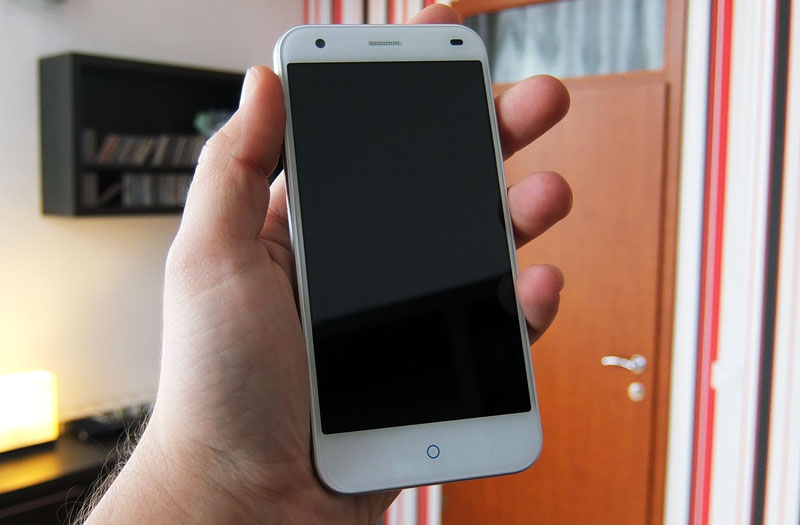
The good thing about copying Apple is that you do end up with pretty good ergonomics and a sleek look. The Blade S6 measures 144 x 70.7 x 7.7 mm (5.67 x 2.78 x 0.30 in) and weighs 134g, which is relatively slim and light for a 5-incher. There are no sharp edges and the curved glass helps make the phone appear (and feel) thinner than it really is. It’s very comfortable to hold, smooth as silk.
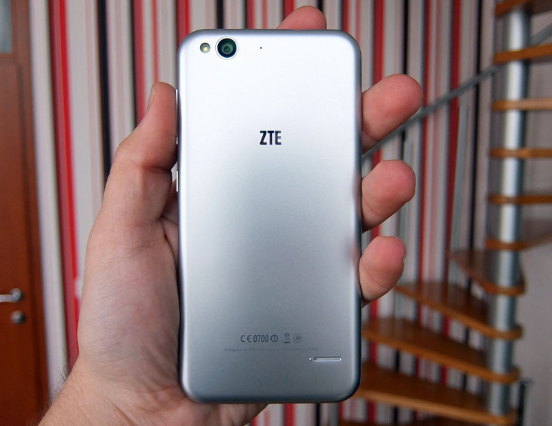
Perhaps a bit too smooth, as the body doesn’t offer a lot of grip. The volume rocker and power button are located on the right side. We have no complaints about their quality or design, tactile feedback is excellent and the finish is good.
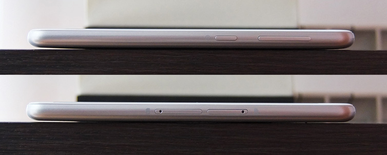
Like we said, the back is plastic, it’s not aluminium although it tries to play the part. It’s not removable, either, hence neither is the 2400mAh battery. We’ve learned to live with non-removable batteries and unibody plastic/polycarbonate designs, especially when they’re done right, but we feel ZTE could have done a somewhat better job. The plastic doesn’t feel much better than a run of the mill removable cover, although you’d expect it to thanks to its unibody design. This is our biggest gripe with the ZTE Blade S6 – the back of the phone doesn’t touch the internals, so there’s a bit of flex when you apply pressure near the centre. This is rather odd, since it could have been resolved with a couple of reinforcement points on the inside of the shell, but someone obviously overlooked this detail.
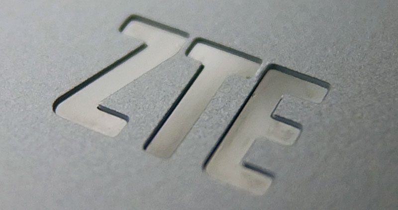
The shell itself feels sturdy and there’s not a lot of flex to the body. The silver-coated plastic isn’t thin. Judging by the speaker and 3.5mm cut-outs, the shell is about a milimetre thick, much more than your average plastic back cover. Although we’re not fans of the faux aluminium look, the finish does have one thing going for it – it doesn’t attract a lot of fingerprints and smudges, so you won’t have to wipe it every second. In fact, just placing it in a tight pocket should get rid of most fingerprints.
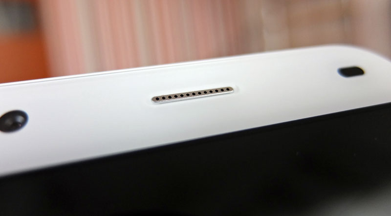
As for ZTE’s choice of colours, we believe a few more options would have been nice, like an all-white one, or maybe a colourful, pastel option. Of course, then it wouldn’t look so much like an iPhone, but that would be a plus for many users.
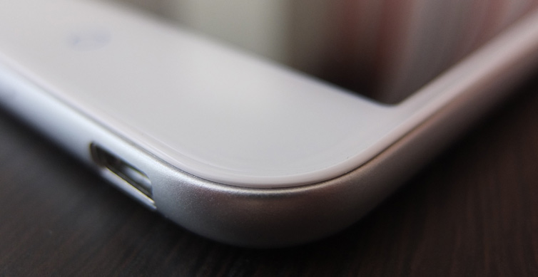
Although we’re not entirely happy with the back, we must not forget that up until a couple of years ago, consumers got a similar tactile feeling on some flagship phones. Placed next to a Galaxy S5, the sides of the ZTE Blade S6 look and feel premium, but the back lets it down. If you prefer to use some sort of silicon case on your device, this is really not an issue. The fact that the 2400mAh battery is not replaceable may be a concern for some users, but thanks to the frugal chipset, we got decent results.

